Contact Type
An analogue study
in light and language
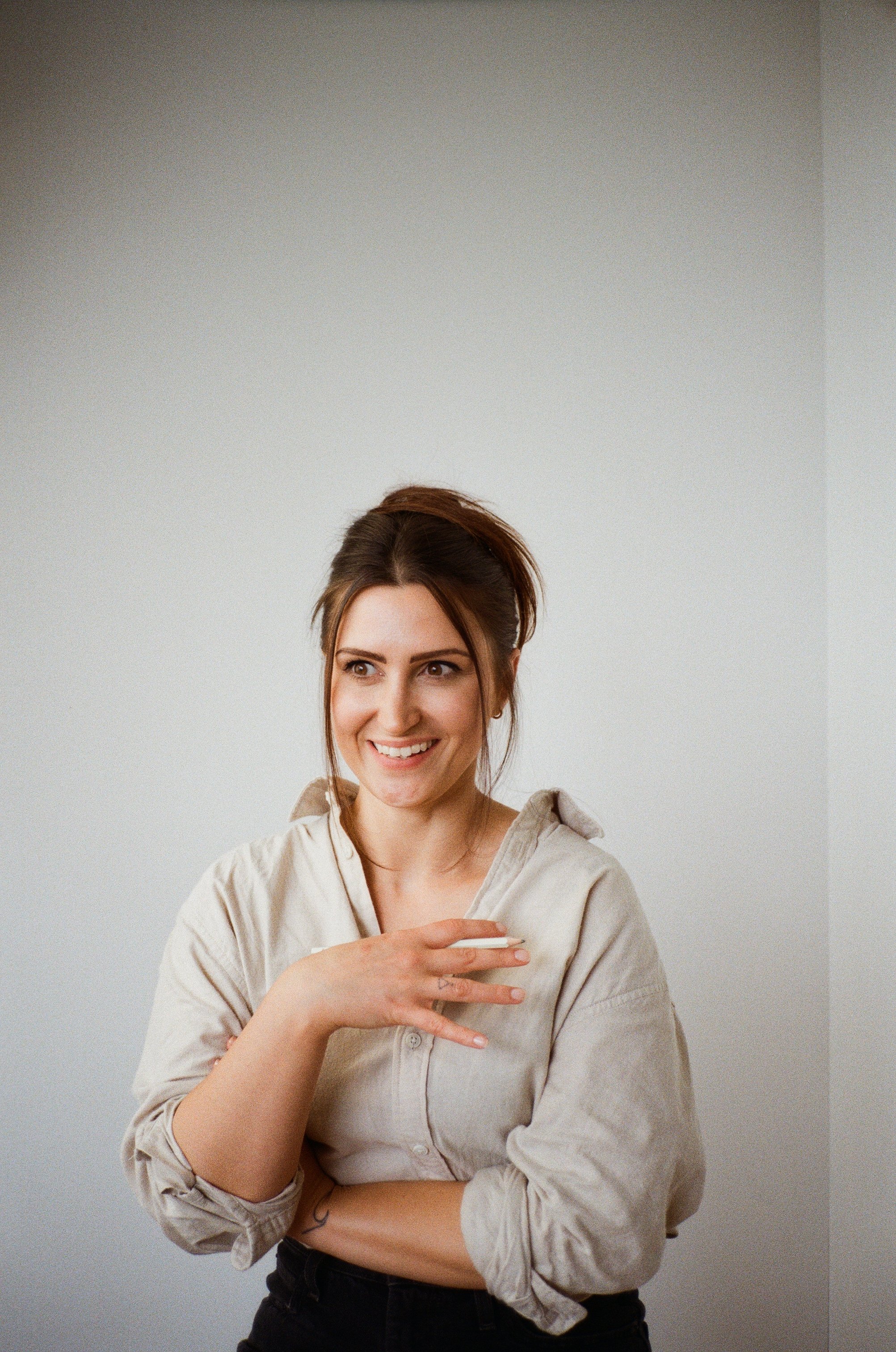
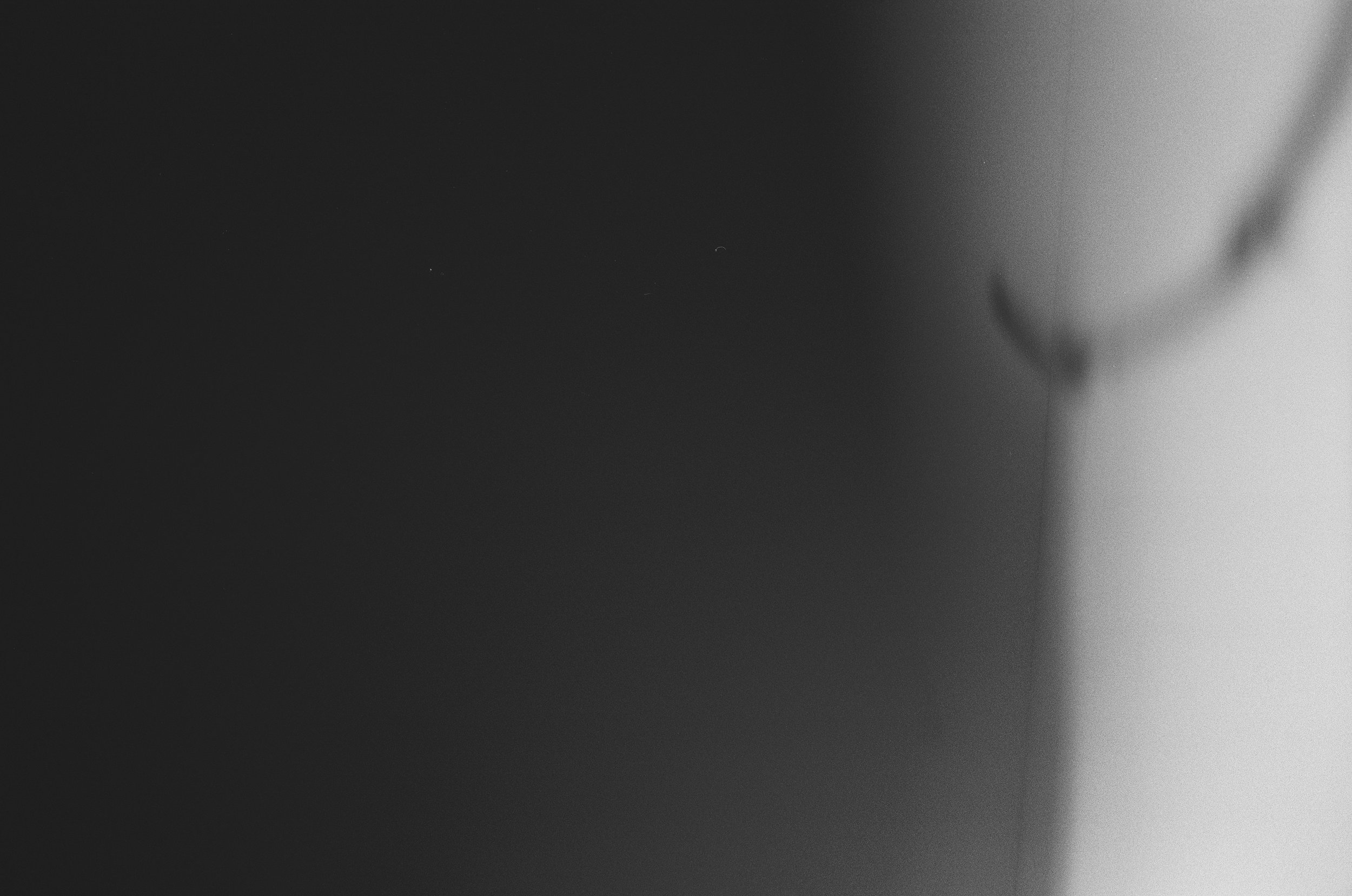
Contact Type is the third piece in the Bec Morris archive — a quiet collision of photography and typography. Made in collaboration with photographer James Melia, the work explores what happens when analogue processes meet analogue identity. It begins with a simple idea: portraits of me, captured on 35mm film, then reworked by hand using letraset, tape, markers, and distortion. Together, we’ve created a series of images that are personal but not performative — an experiment in contrast, both visual and collaborative.


Back to my roots
The methods used in this piece aren’t new to me. Letraset, film, and collage formed the backbone of my early design education — and I’ve missed them. I still remember working on a project in college where we had to design onto a vinyl record sleeve using a song of our choice. I picked Wuthering Heights by Kate Bush and layered foggy blues and greys with carbon paper and transfer type. It ended up murky, moody, and full of texture — and it sparked something in me. Contact Type is a return to that kind of work. Tactile, unpolished, imperfect. A reminder of what made me fall in love with design in the first place.
Letting the process
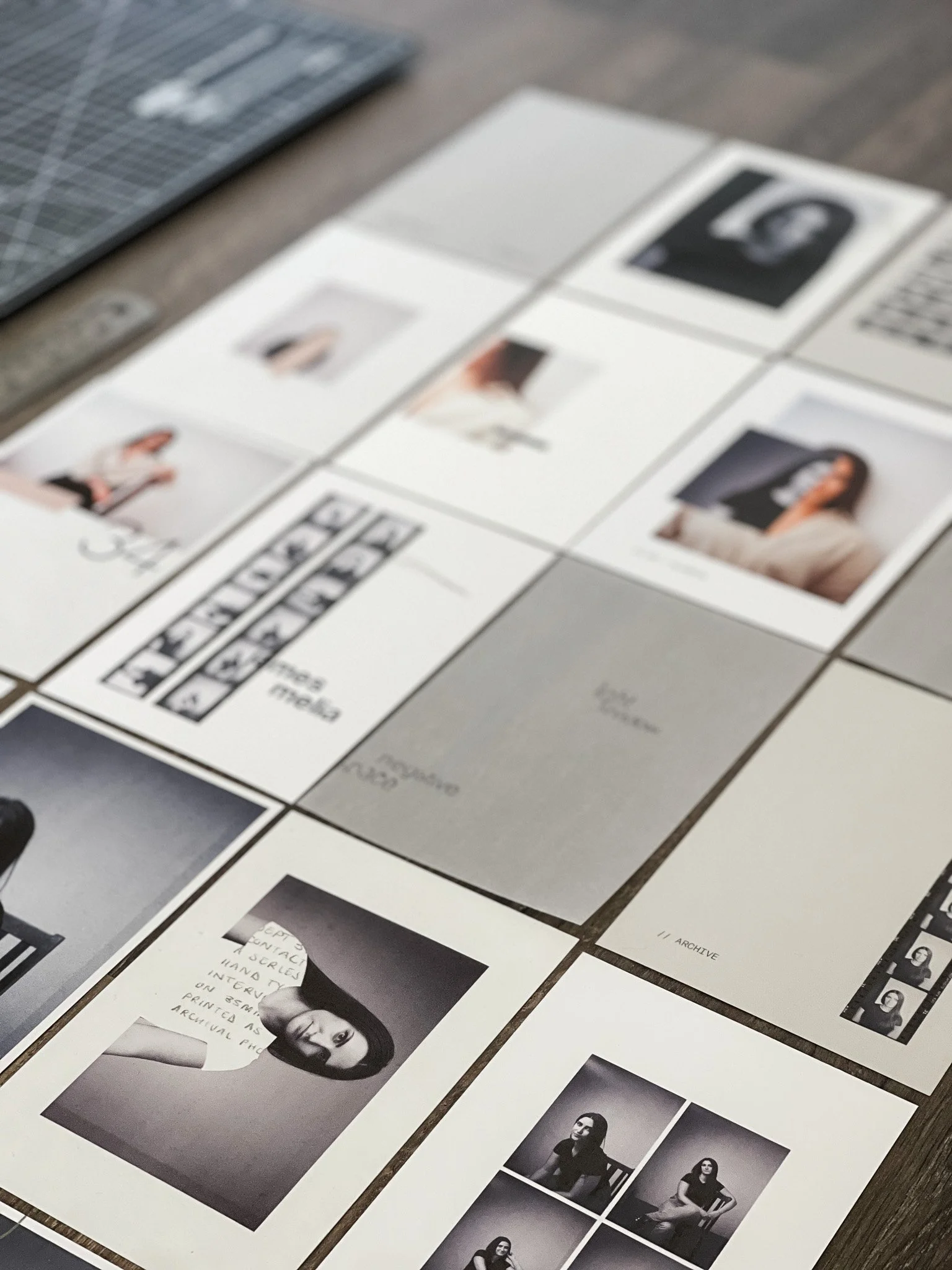
The prints are 6x4 — a deliberate nod to traditional photography and the idea of loose, archival image sets. Each one is printed on a different stock, all sourced from GF Smith’s collection. Originally, I thought I’d bind the pages together, but someone who knows both me and James well suggested something else: leave them loose. Let the chaos in. It felt right. That push and pull — organisation versus instinct — became the structure of the piece. Scribbles and cut negatives sit beside careful layout and neutral tones. Light is layered with shadow. Control meets imperfection.

A layered archive
The final edition will be housed in a translucent vellum envelope — a nod to type, texture, and darkroom sleeves. You can’t see the full picture at first. Pages overlap. Type shifts. The story changes depending on the order you pick up. It’s designed to feel like a private archive — something that asks to be rearranged, and maybe even worn down over time. The words that appear across the pages weren’t written ahead of time — they came through the process, pulled from the tone of the images and the contrast within them. Some pages hold light, others hold shadow. Each viewer builds their own sequence, their own way in.
More to come
This project is still unfolding — more prints may be added, and more phrases might surface. But the direction is set: analogue tools, real collaboration, and a shared appreciation for things that feel slightly unfinished. Slightly human. We’re sharing it as it evolves — not to document perfection, but to show the beauty in the process of an analogue project.