


Sticky Mat Coaching
A holistic identity that captures the movement, imperfection, and balance of personal growth.
Sticky Mat Coaching: Embracing the Journey Through Change
Sticky Mat Coaching blends the principles of yoga, coaching, and Traditional Chinese Medicine to help women navigate personal and professional transitions with balance and purpose. Founder Natalie wanted to evolve her offering from a small yoga practice into a brand that embodied long-term transformation — one that spoke to both the mind and body.
Together we built an identity that would hold space for imperfection, growth, and renewal. Sticky Mat became a reflection of Natalie’s grounded yet empowering approach: a brand rooted in human warmth and the natural rhythms of life.


The Challenge
Natalie’s vision was clear — she wanted to move beyond the surface level of yoga and wellbeing, and build something deeper. Her work guides women through seasons of change, helping them reconnect with themselves and their inner direction.
The challenge lay in translating that philosophy — the cyclical nature of transformation — into a visual and verbal identity that felt organic, calm, and human. We wanted to create a brand that acknowledged life’s texture: the smooth, the uncertain, and everything in between.
The Process
Brand Strategy & Messaging – We began by uncovering the foundations of Natalie’s philosophy: inspired awareness, sustained transformation, and cyclical living. Her work draws on Traditional Chinese Medicine and elemental balance — the interplay between fire, earth, metal, water, and wood — to help women find harmony in transition.
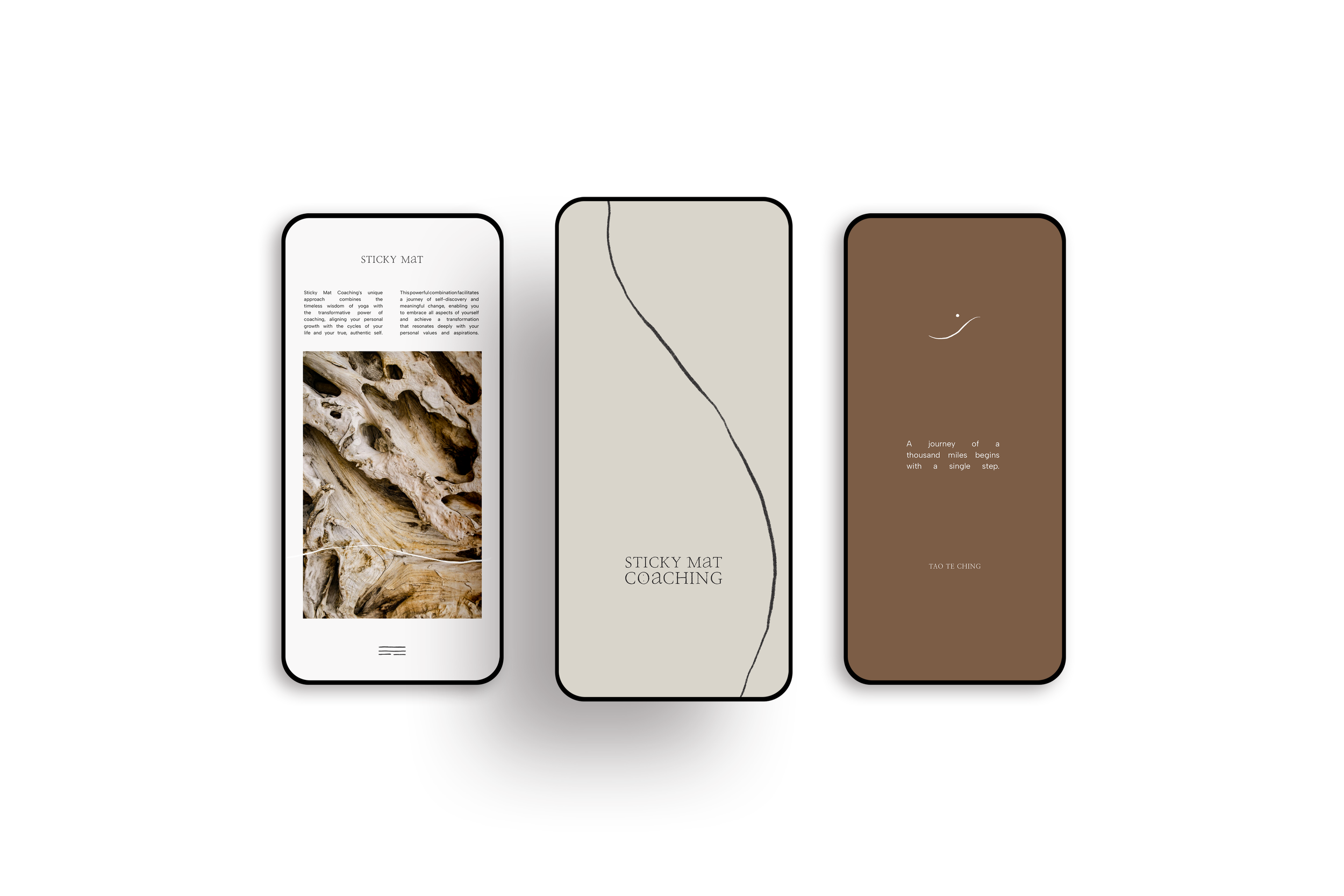
Identity Design – The brand identity was built around the concept of “the journey.” A series of hand-drawn icons and flowing lines symbolise movement and change, each one reflecting the organic rhythm of life’s path. The pencil-drawn logo became a focal point — imperfect by intention, representing honesty, humanity, and the beauty of process.
Typography & Colour – A pairing that creates balance between grounded elegance and calm clarity. The earthy palette — pepper, burlap, cinnamon, sand — evokes warmth, stability, and connection to the natural world.
Print & Digital Collateral – The brand extended across stationery, social templates, and marketing materials. Each piece was designed to feel personal and tactile — a blend of the spiritual and the practical, much like Natalie’s work itself.
Studio Session – A year later, we revisited the brand in a one-to-one studio session, refining tone and visual direction as Sticky Mat evolved. It became a moment of reflection — an opportunity to realign the brand with Natalie’s continued personal and professional growth.


Every brand has its own rhythm. My role is to help you find it — refining what already exists and revealing what’s been waiting beneath the surface.
Ready to realign your brand’s direction?